A Case for Color
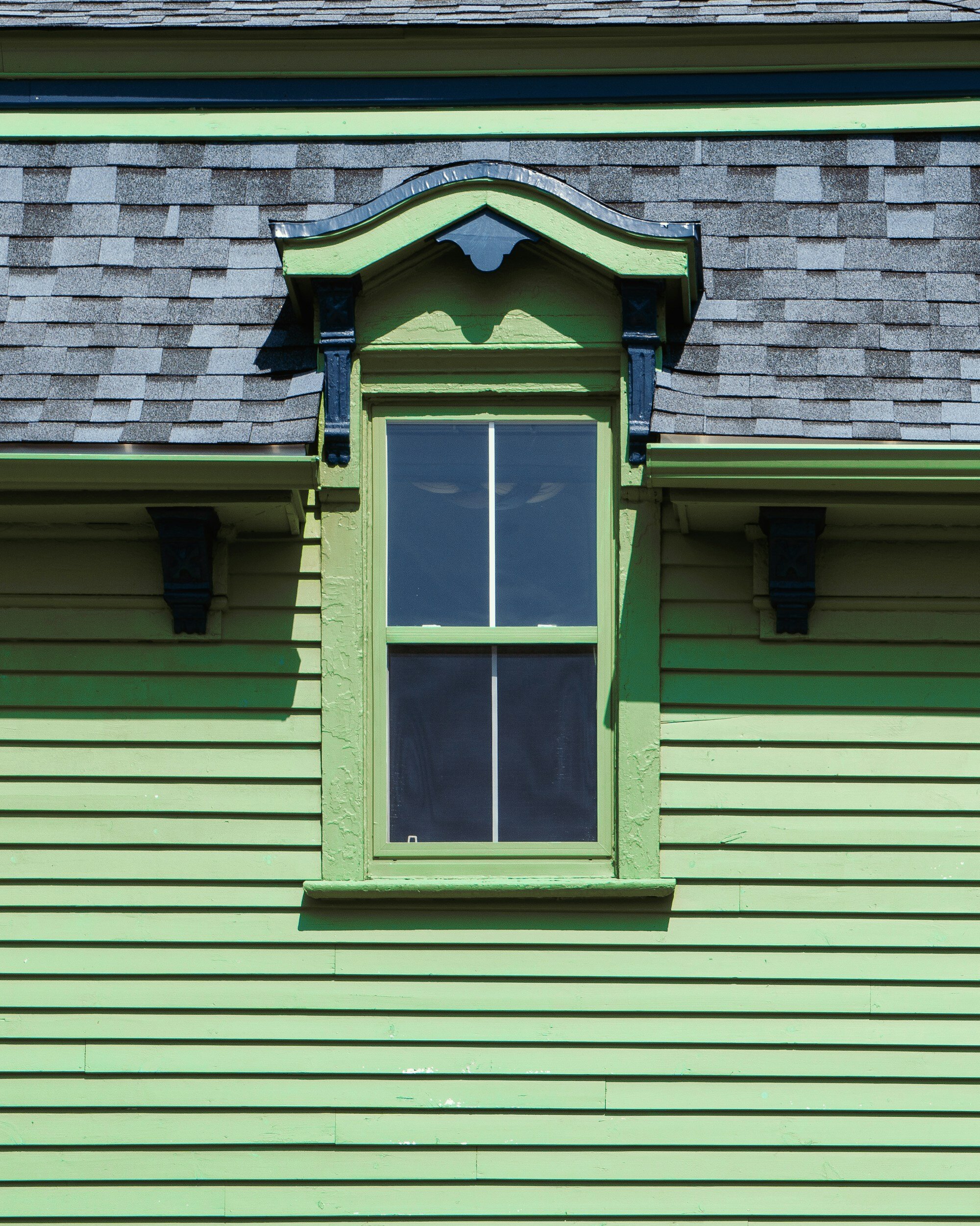
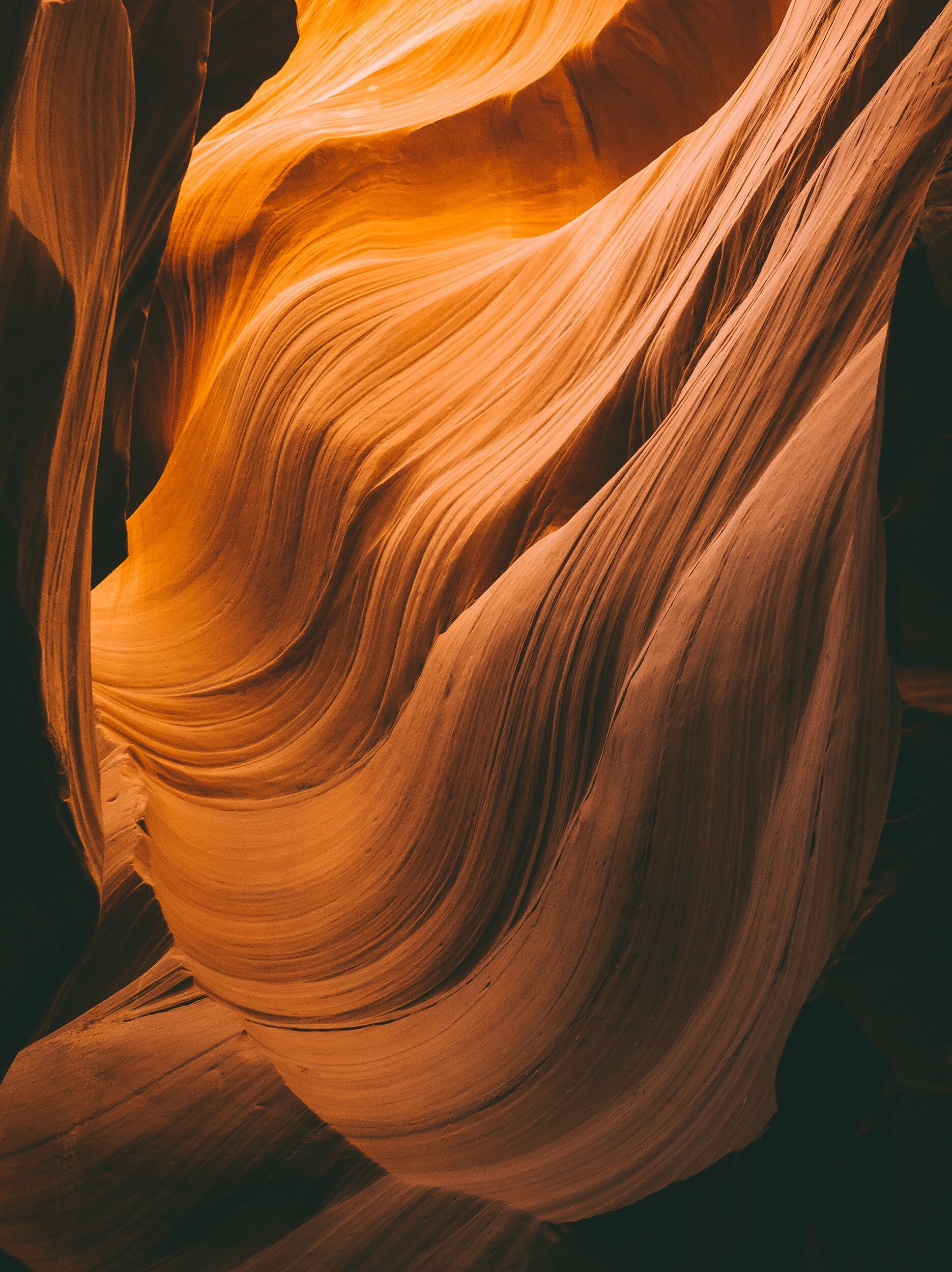
A version of good taste gets handed to us before we ever choose it ourselves. Walk into a showroom, a real estate listing, a design magazine it's white walls, pale wood, a palette that apologizes for itself. We're told this is what "elevated" looks like. But nature has always been our greatest source of inspiration, and it is in nature that we feel most at home. Part of that connection is rooted in our genetic and cultural memory, the diverse array of textures and colors we're built to respond to. So it's worth asking: why should the spaces where we spend the most time, meant to be enriching environments, be devoid of those natural elements?






Where "Neutral" Came From
Here's a question worth sitting with: where does the idea come from that white, neutral, and minimal is the only serious aesthetic at the top of some invisible hierarchy, with color and pattern sitting somewhere below it, closer to "too much"?
It isn't neutral. It has a history.
In 1908, the architect Adolf Loos wrote an essay called Ornament and Crime, one of the founding texts of modernist minimalism. In it, he imagined a future where cities would "glisten like white walls," progress measured by subtraction: less ornament, less color, less of what he considered decoration. He wasn't shy about what he attached that to. Ornament, in his framing, was a marker of primitive culture; its absence was a marker of civilization. That idea didn't stay in 1908. It became the aesthetic DNA of a century of "good design," and it traveled through colonial-era hierarchies of taste into what we now just call neutral.
The writer David Batchelor has a name for the result: chromophobia. A fear of color that gets dressed up as rationality, cleanliness, control, while color itself gets coded as excessive, foreign, undisciplined. It's not an accident that the places most associated with "too much color" in the Western design imagination are almost always the same places that were once colonized by it.
None of this is a judgment on anyone who genuinely, simply loves a white room. White is a color too, and it can be exactly right for a space. But it begs the question: why is that specific palette treated as pristine, as the ceiling of good taste, when so much research and thousands of years of vernacular building across cultures point the other way? Stimulating, color-forward environments tied to the specific purpose of a space aren't a design trend. They're older than the idea of neutral by a very long way.
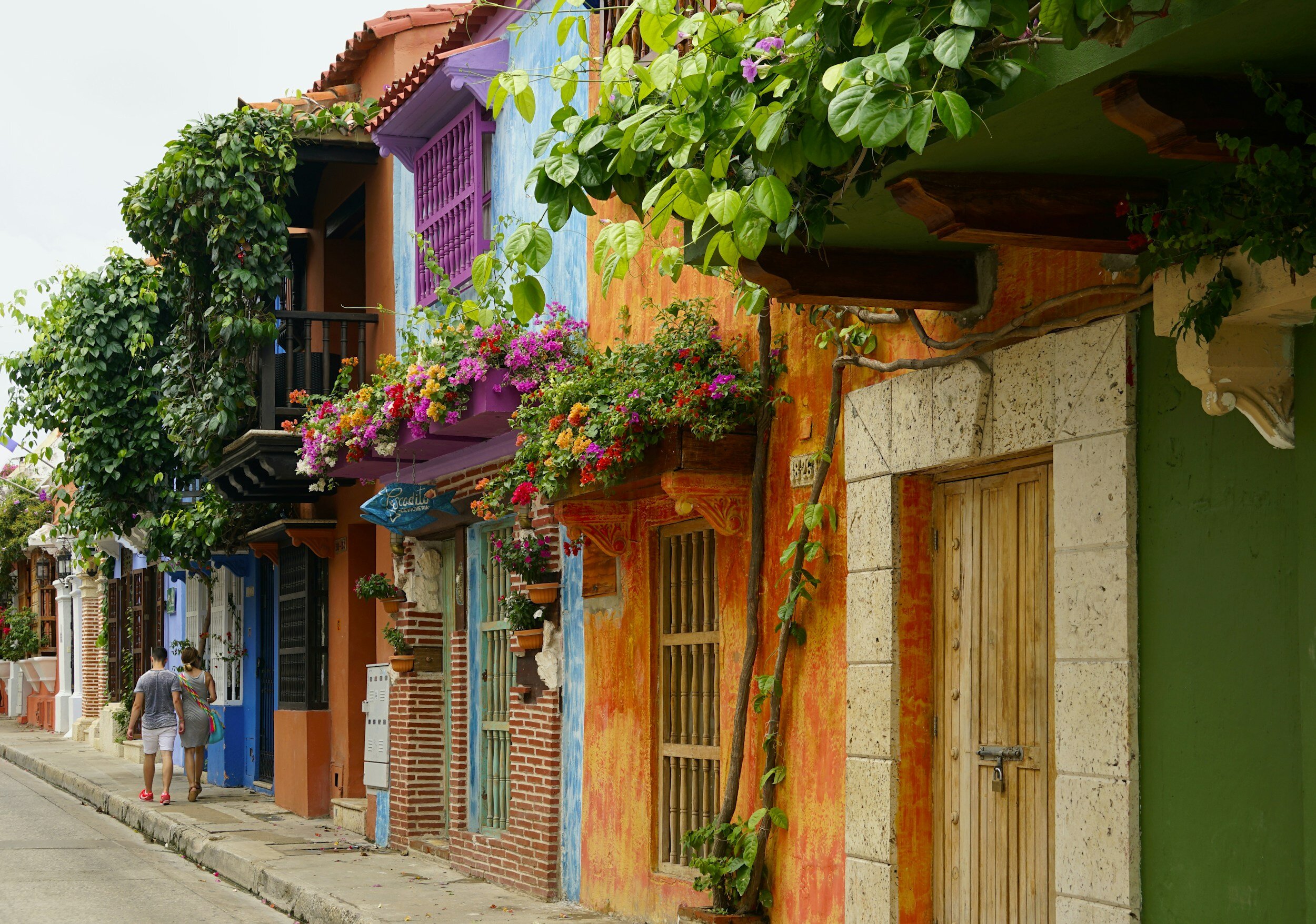
And there's an irony most of us have lived without naming it: we leave the West, and we seek exactly this out. We fly to Jaipur, to Mexico City, to Marrakech, and we come home talking about how alive those walls felt, how a color could hold an entire mood in a single room. Then we walk back into our own homes and reach for the same greige we left behind.
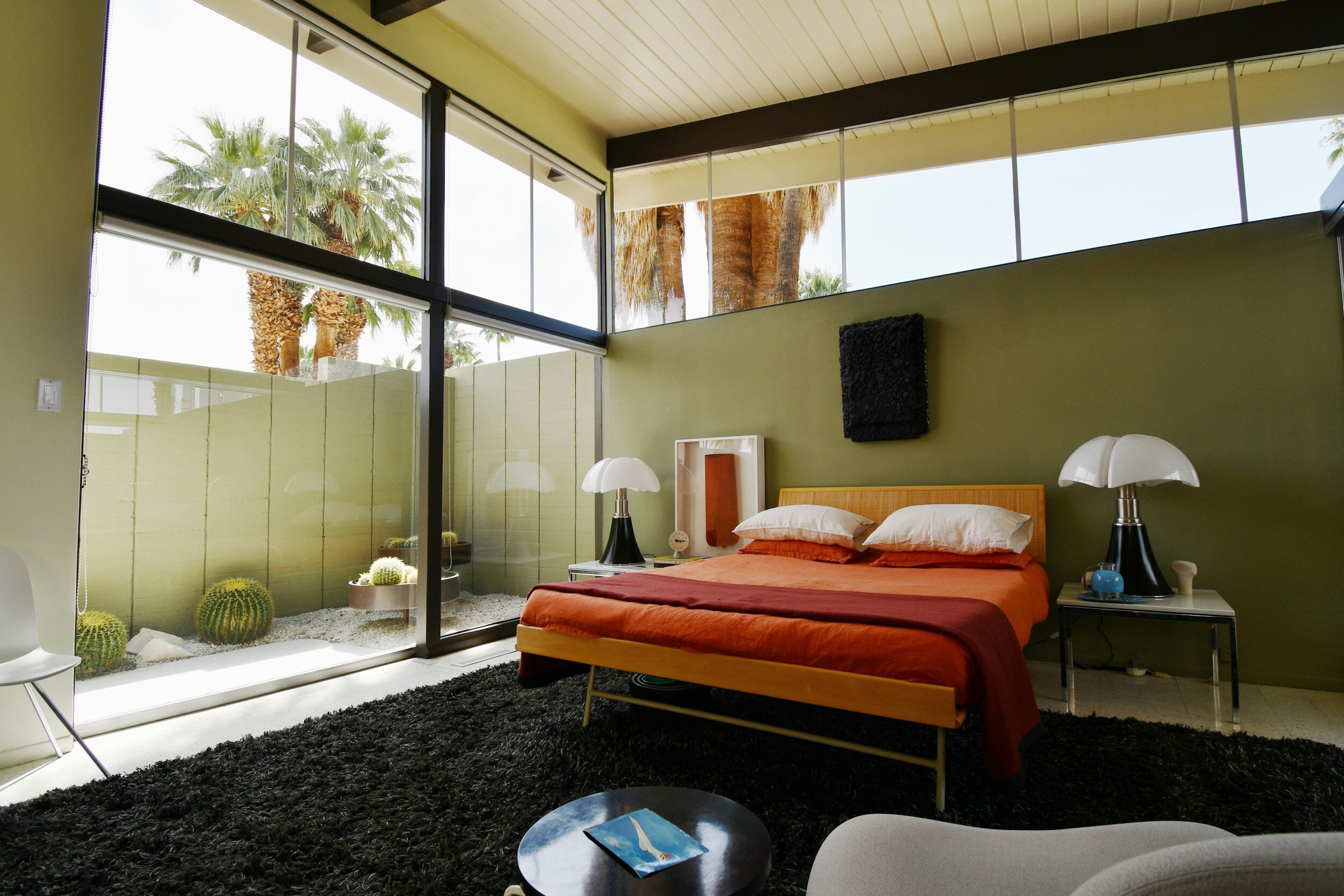
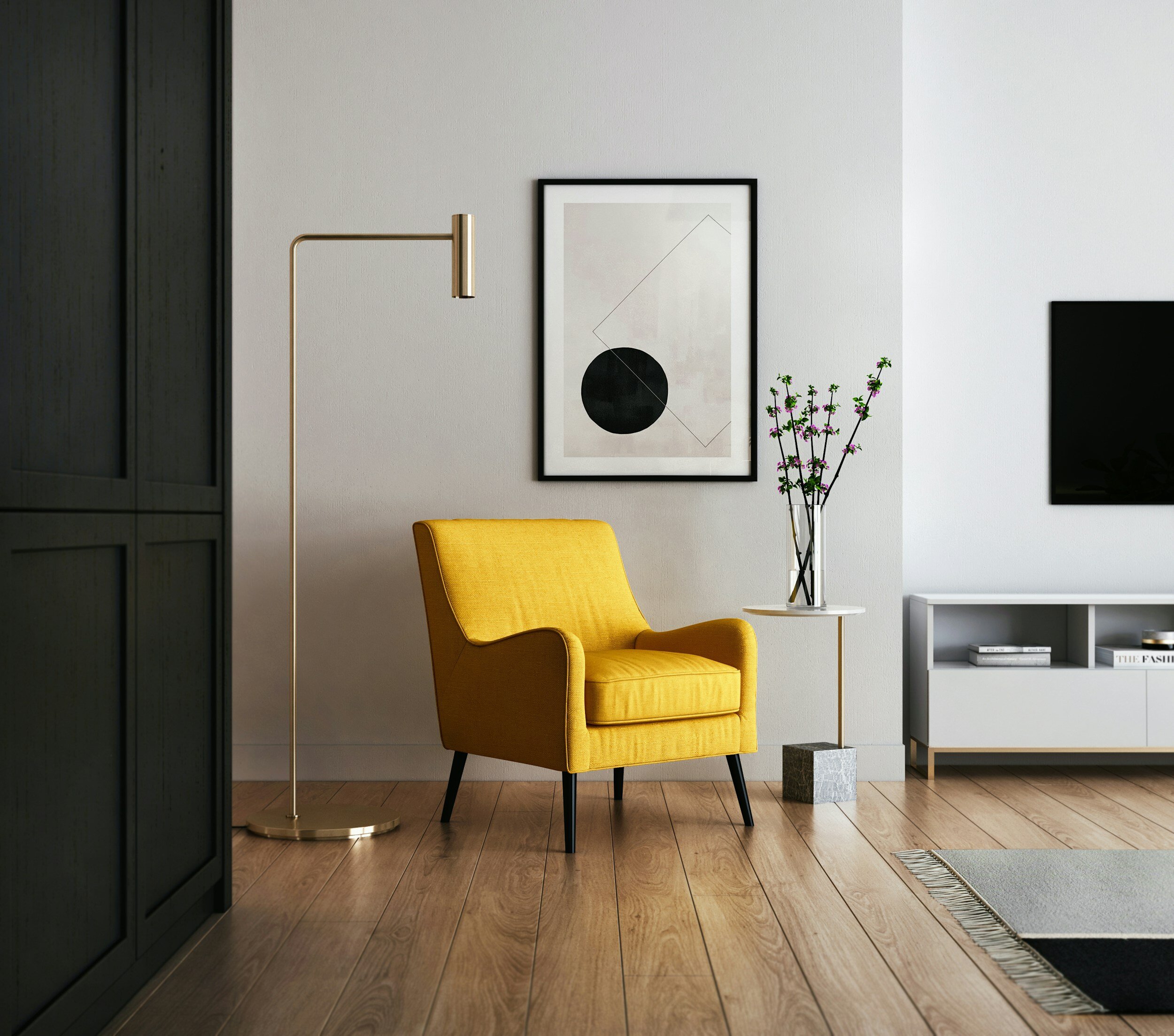


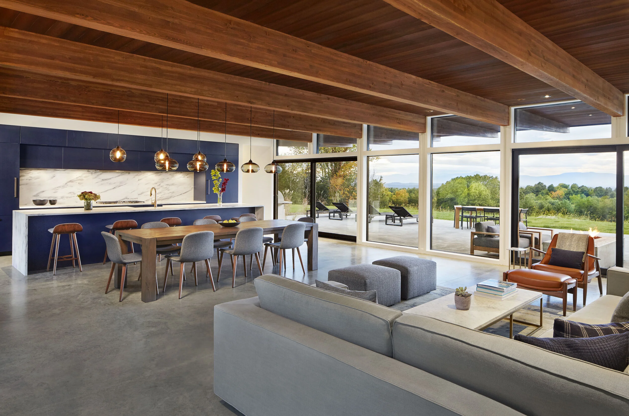
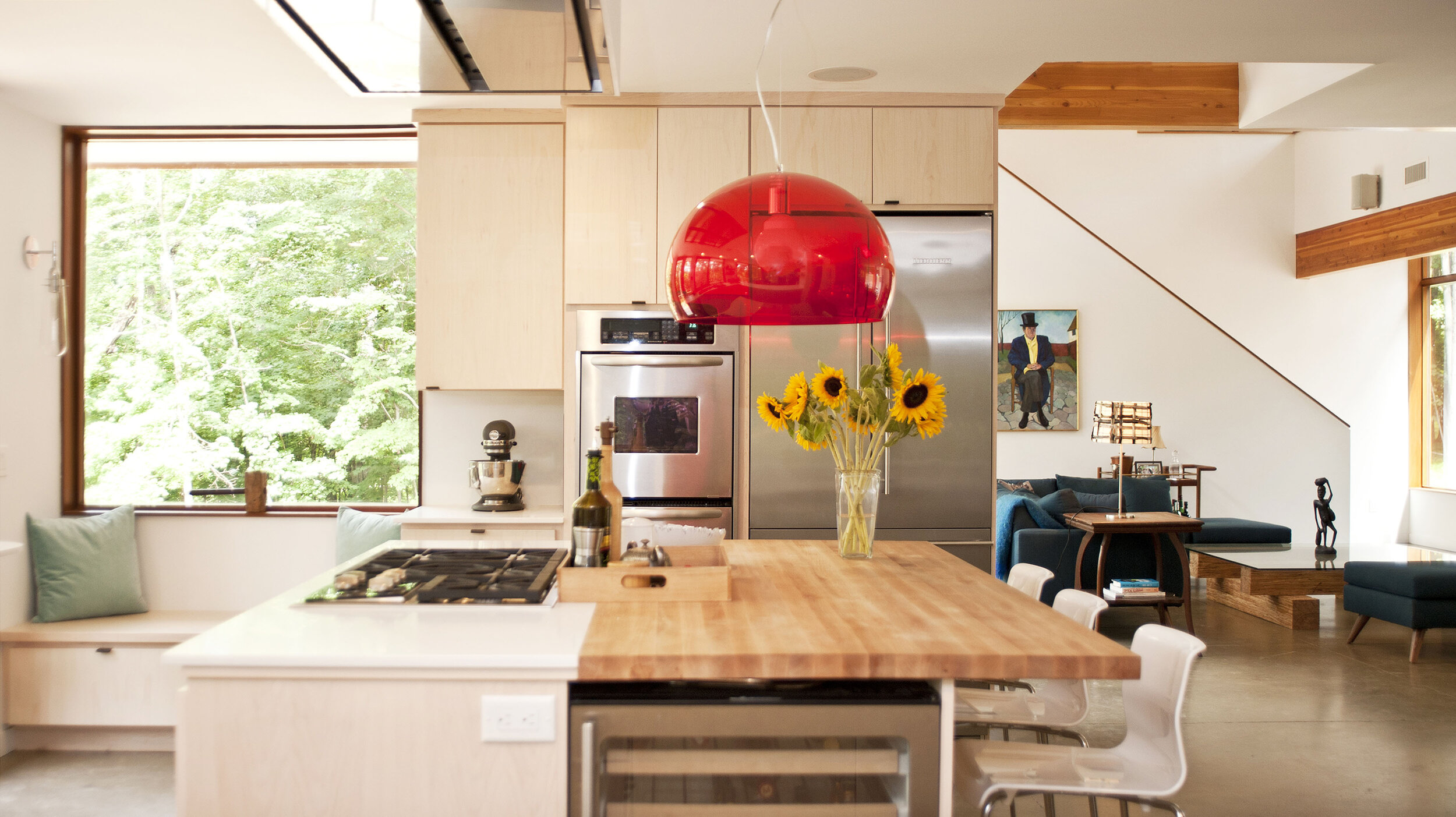

Color Shapes the Room You're Actually In
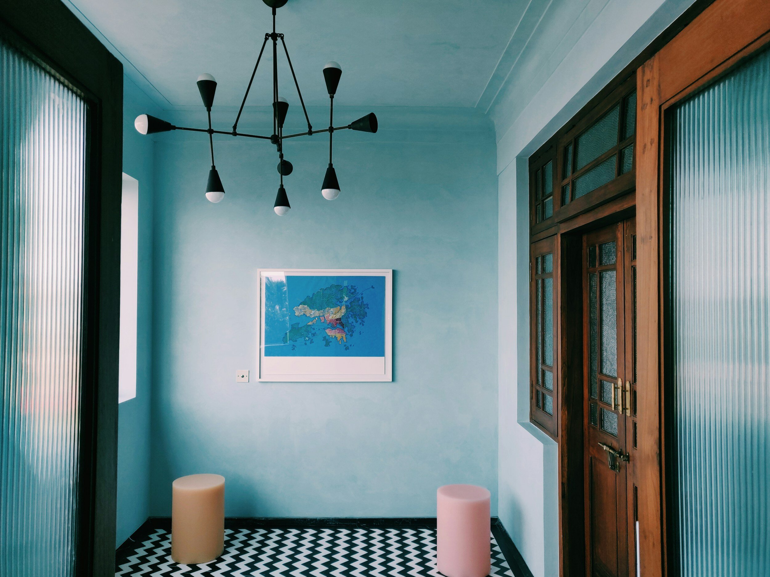
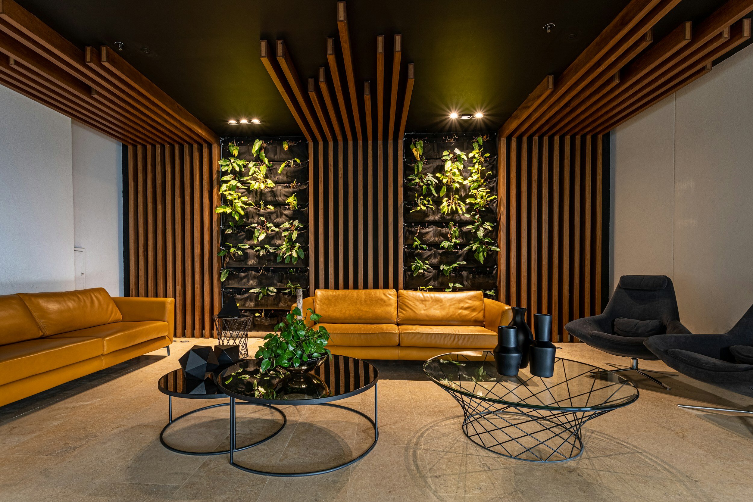
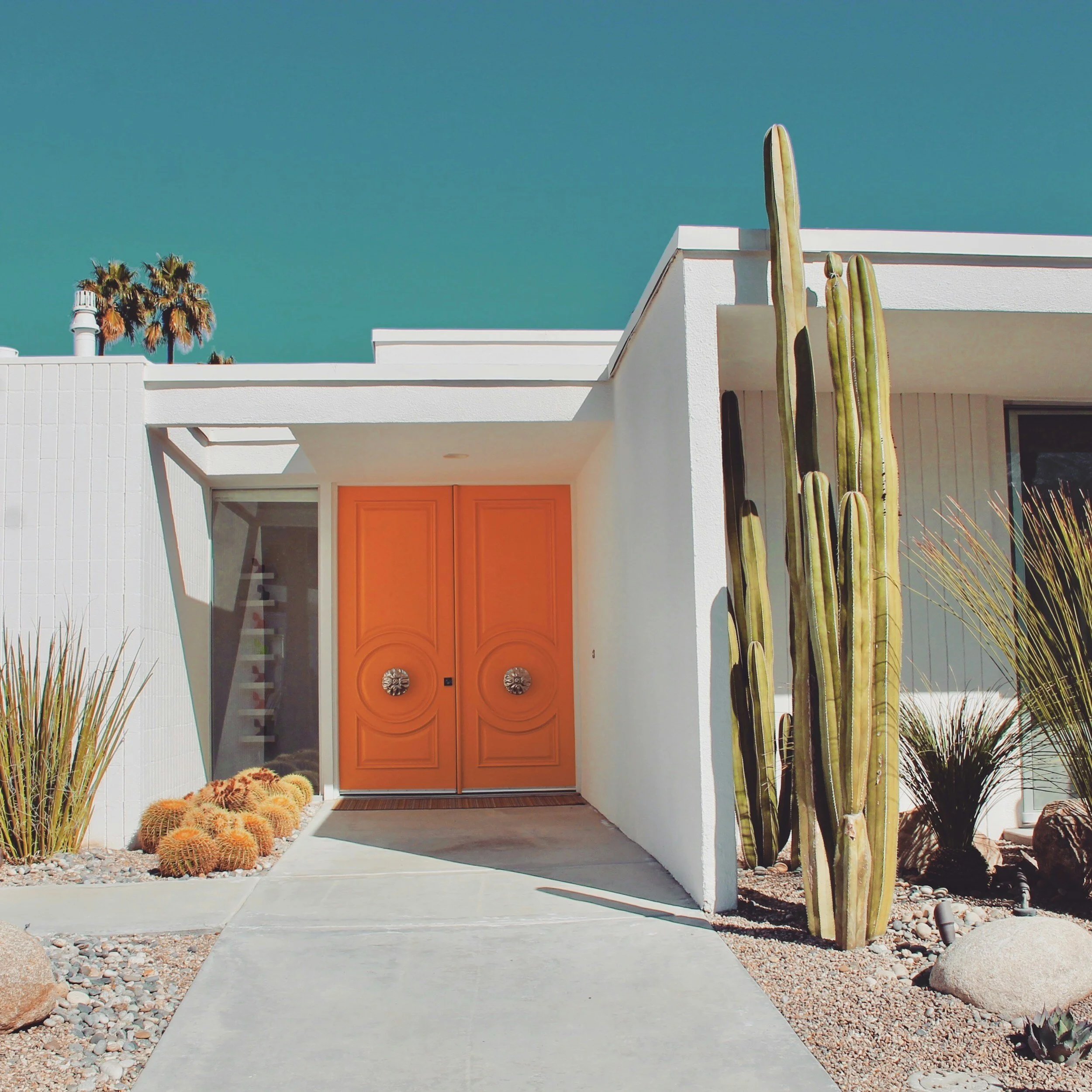
Color shapes a space's atmosphere and how you perceive it. Architects like India Mahdavi, Sanjay Puri, and Luis Barragán have built entire careers on that fact. Used deliberately, color adds dimension; it can create joy, delight, and pleasure in a way flatness rarely does.
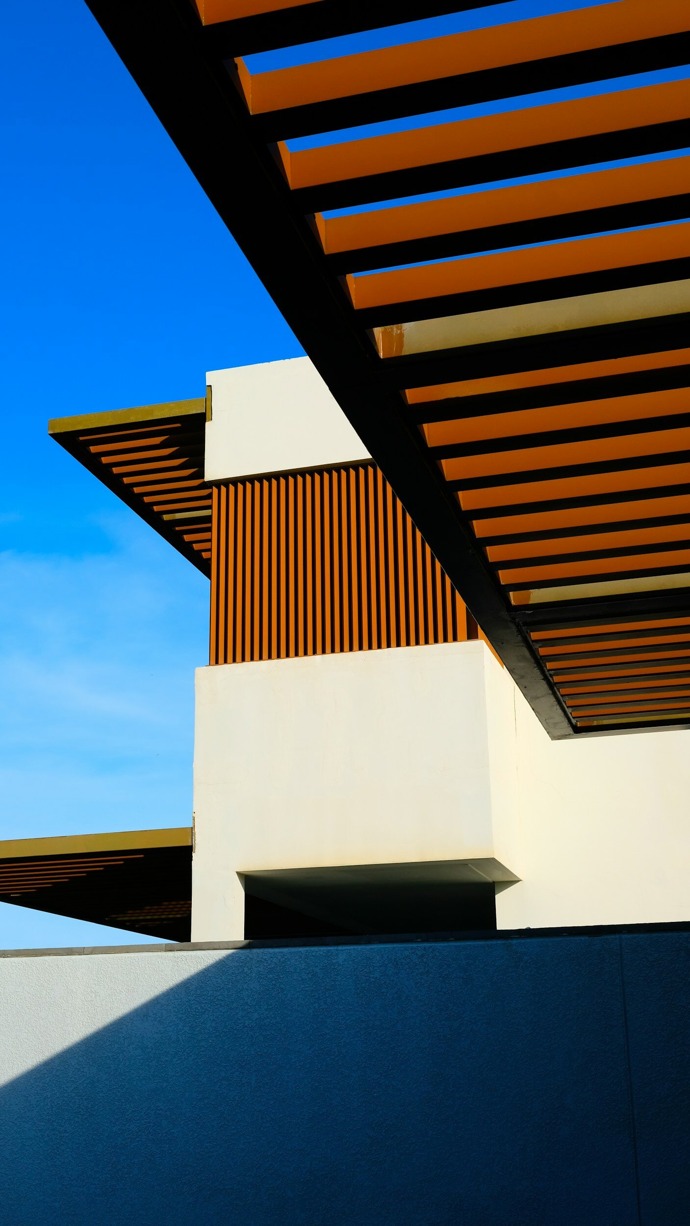
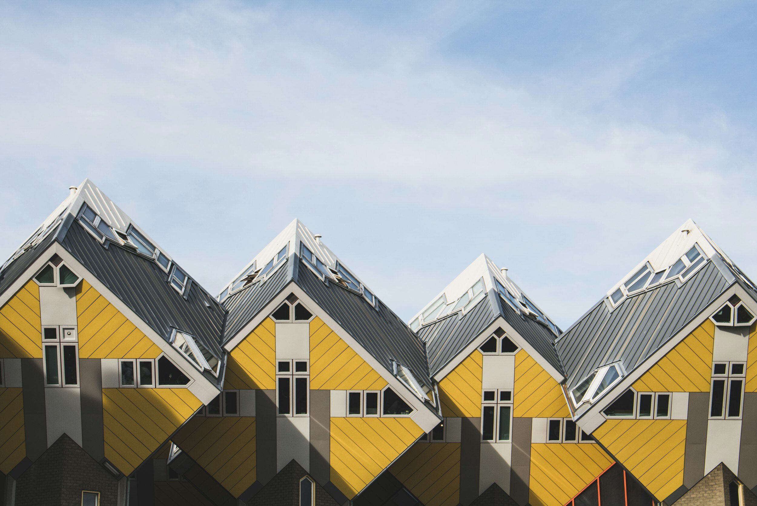
Color isn't just decorative. It's communicative; it tells you something about a space's function, identity, and values before you've consciously registered any of it. It guides people through a building and emphasizes the architectural features worth noticing. Outside, it can create a focal point, or root a structure into its natural surroundings instead of standing apart from them.
It also does real spatial work. In a neutral shell, introducing color to a wall, floor, or ceiling changes how the room actually reads:
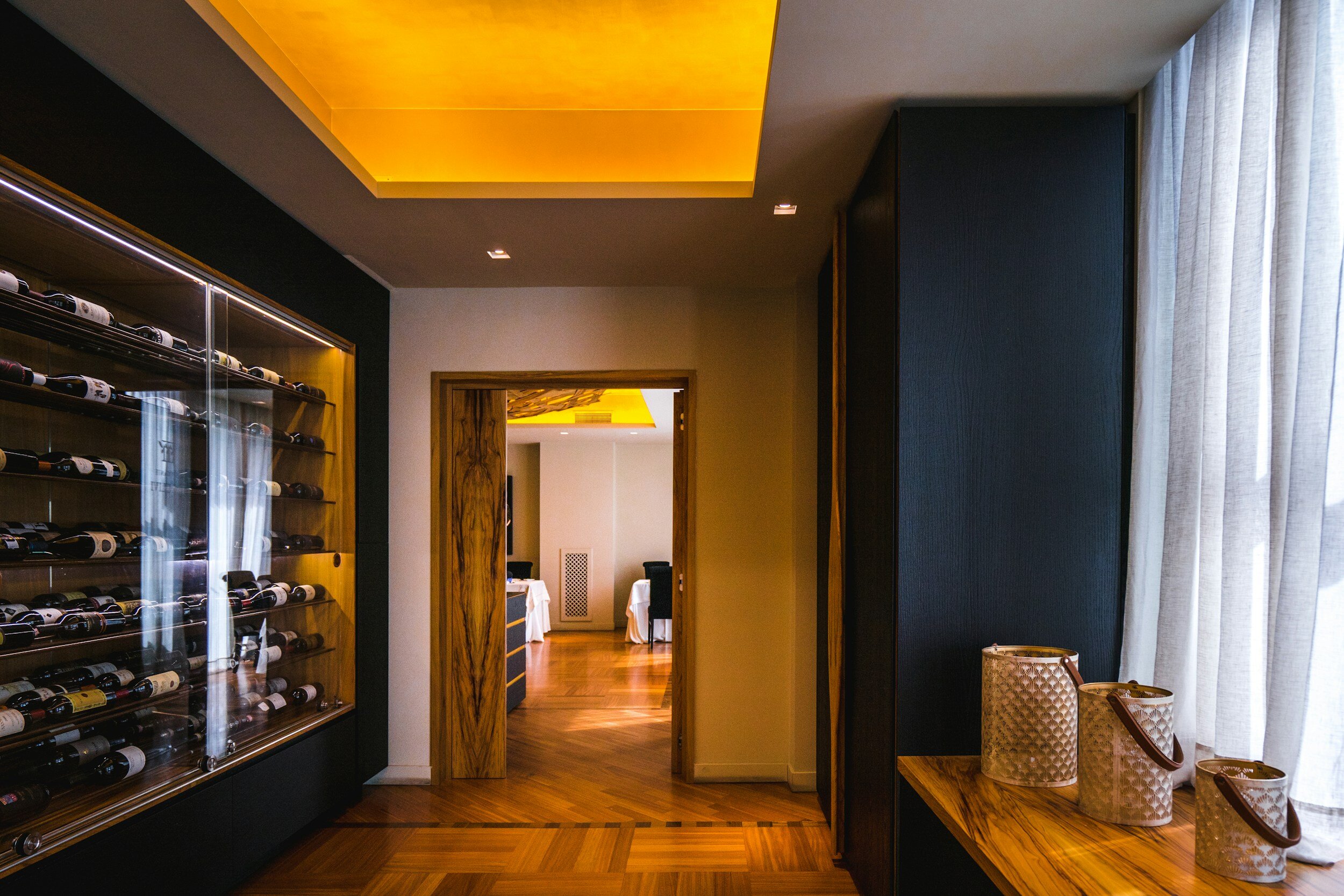
A darker ceiling lowers a space, visually.
Coloring a central wall compresses the sense of depth.
Painting the lateral walls narrows a room; painting the central wall and ceiling the same hue expands it.
Painting all surfaces to half-height, with darker tones above, can manipulate perceived height entirely.
The Basis of Color Psychology
Color theory, applied well, is one of the most powerful tools in design, a form of non-verbal communication that conveys a mood in a fraction of a second, before language catches up.
Yellow — optimism, curiosity, a cheerful atmosphere.
Blue — positivity, confidence, a sense of security.
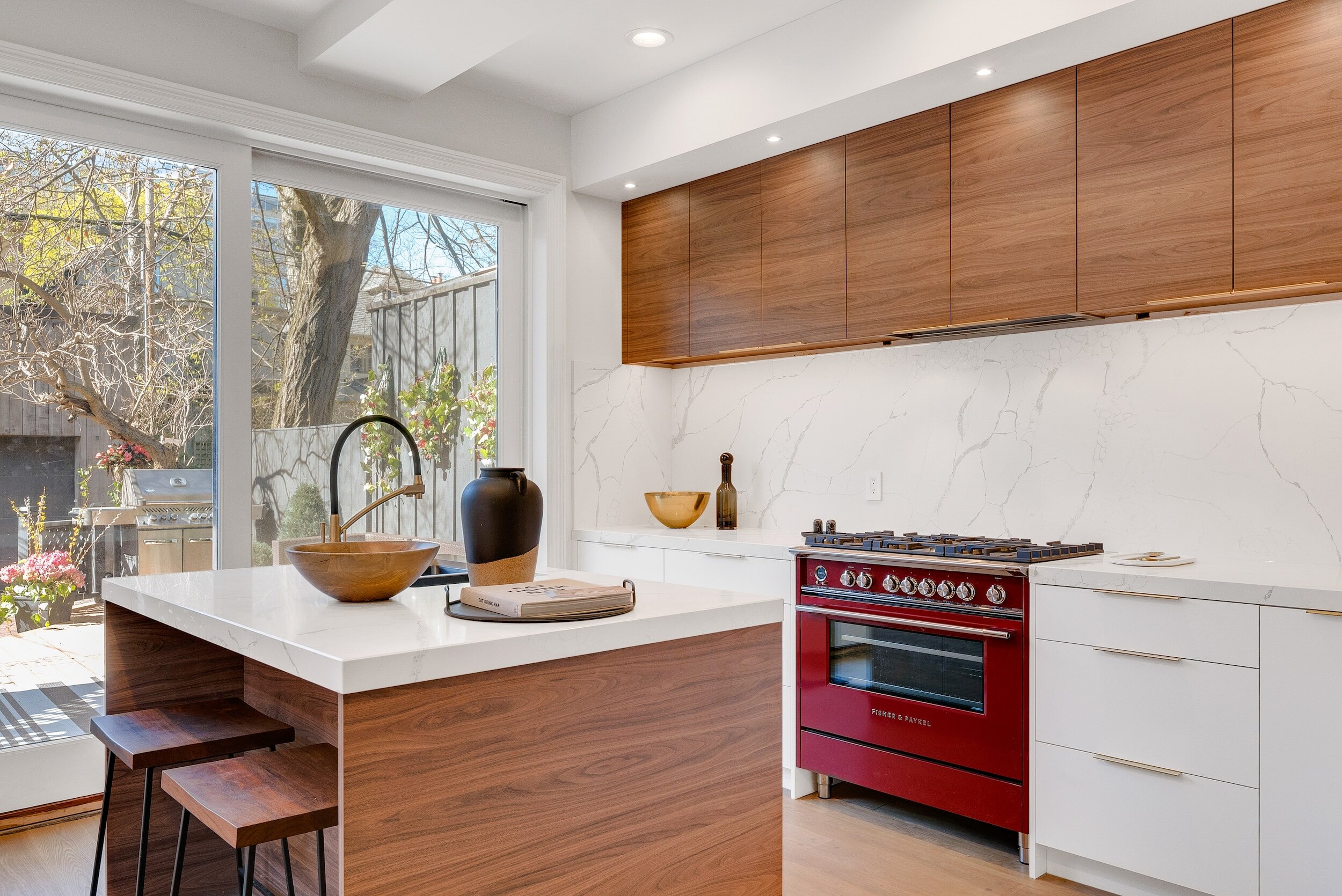
Red — energy, excitement, impulse.
Green — calmness, tranquility, serenity, well-being.
Orange — intensity, creativity, euphoria, enthusiasm.
Violet — well-being, calmness, softness.
→ Book a design consultation → Read more: Why Your Home Deserves More Than White Walls